

Monday, 9 April 2012
Pub Progression
Managed to finalise the assets for the pub building that sits next to the bank. I ended up creating a mesh for the corner wall of the building as I was getting shading artefacts with bsp. I also reduced the cap at the top between the top of the windows. I felt that it was just to straight and bland that's is what lead me to add the top floor with the smaller windows. This broke up the shape of the building.


Friday, 6 April 2012
Glass Building
Created some more assets that make up the glass building that sits opposite to the bank. I used a reflection plane to create a real time reflection in the windows. Worked out pretty well. Still need to add some more detailing when I make some more assets for the buildings. You can also see I added the street lamps.

I used to normals from the water to create the rippled effect in the reflection. This did the job and saved me some texture space by not having to create a separate texture.
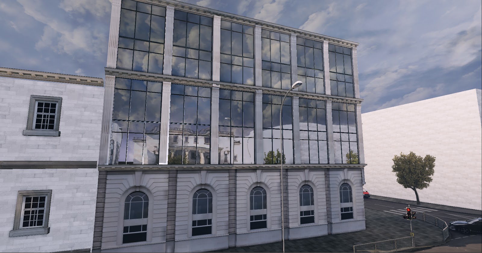
I used to normals from the water to create the rippled effect in the reflection. This did the job and saved me some texture space by not having to create a separate texture.
Tuesday, 3 April 2012
Plaza Floor
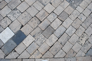
Decided to go with a cobble floor for the plaza area. One that i liked the most from my reference was from our London trip but the picture wasn't the greatest for creating a texture so some editing was in order
Original
Texture

Added some variation into the bump map to make the bricks uneven. Also the grout was very dark in the picture so I create a mask by painting out the grout areas and lay a texture underneath. This help the normals read better and make the cobbles look raised out of the ground slightly.
I made the edges of all the bricks catch more light in the specular also to enhance the normal map details.

Original

Texture

Added some variation into the bump map to make the bricks uneven. Also the grout was very dark in the picture so I create a mask by painting out the grout areas and lay a texture underneath. This help the normals read better and make the cobbles look raised out of the ground slightly.
I made the edges of all the bricks catch more light in the specular also to enhance the normal map details.

Sunday, 1 April 2012
Foliage
Been working on the foliage for outside the bank. I decided to go for evergreen plants and shrubs as these are the types of greenery you see around towns and cities. This is because they are around all year long and need no maintenance. Also because the scene is set around this time of year there isn't any flowers in bloom yet.
I used some reference form beck home as we have these scattered outside our house along the driveway.


I used some reference form beck home as we have these scattered outside our house along the driveway.


I cut out the parts I wanted and lay them out to create the diffuse map. Making sure I left enough room to cut round them in Max to create the planes. I also crated the bump map to generate the normals.

I used the same workflow I used for the trees to create the plants and the material was also used as it is set up so I can create and instance and swap out the diffuse and normals.
I experimented with painting the verts to create a realistic look as they blew in the wind. for example the base verts are black so they don't move and all the tips of the leaves are full red so they move the most.

I also changed the parameter in the material to enhance the wind effect.

Lastly I created another instance of the material as I felt I needed more colour variation. In the new instance I changed the parameters for the colours ever so slightly to add a subtle variation.

Thursday, 29 March 2012
First building - the Pub
So as I said in another post, I wanted some specific building in the vicinity of the bank. Interesting an detailed. Then the level of detail would be simplified on building that will be further away from the playable area (LOD).
So I decide to start with what will be the more complex of the bunch. Or should I say the most assets of the bunch.
A pub/ bistro was an element I wanted to add. As the area is of a financial setting I decided to name the pub "The Vault". Pubs in specific area of a town or city generally have names based on things close by. For example there is a club named the vault in Leicester that is near a bank. So the first thing I did was create the logo I wanted to have this for the sign and on those little partition walls you see outside pubs and bistros.

As this is my first building I wanted to talk about my workflow. All my buildings start of with the texture. I've gathered allot of reference from around Leicester and London to create a set of buildings for the scene.
First step is to correct the perspective of the building from the picture. The best way to do this is use the lens correction filter in Photoshop.

Its also impoertand to use lines and grids to make sure everything is perfectly square.

To finish of I use the stamp to remove artefacts that will make the section of the build look repeatable. Especially the windows. These need to look neutral.

This can be seen the most in this picture. The reflection is very strong so I will need to remove them as I will be having allot of these windows lined up next to each other.

Here is another example of another piece I will use for the building. I like to use trim pieces at the bottom of the building as these tend to have dirt and help the building blend in with the pavement.

Just a case of correction again and removing the two black grates.

This piece is then copied into its own document so I can use the offset filter and make it seamless.

Here are some of the assets I have so far. Still need to do a couple more such as the sign and doors.

The last two shots show what I have so far for the building. I'm happy with this so far but I still need to add elememts such as a trim at the top and create some "A" boards to go on the street.

Tuesday, 27 March 2012
Pillars


It was also important to create a high poly model as the mid section has indentations. Even at the lowest possible resolution in the mesh the tri count would have been very high. The normal map created some nice Lighting, but looking staright on without and light to catch the edges, the indentations couldn't be seen. An ambient occlusion map was baked out with the normals. This is then overlayed on the diffuse texture. This made the details pop and read a lot better.
The Bank

Got the bank 99% finished. Need to tweak some of the colours in the teaxtures to make them all fit together better.

The above picture is the bank i referenced from Leciester. Key features i wanted to include was the main archway, he tall sindows, th pillars and the facades.

As the original bank connected straight onto the street i had the idea of creating a large anopy held up by large pillars. This is a very common feature of banks in london including the royal exchange (pictured above). This is another building that stood out to me on our visit to london. I drew alot of insperation rom this build especialy with the frot plaza area.
Subscribe to:
Posts (Atom)