Thursday, 3 May 2012
Hand in Screenshots
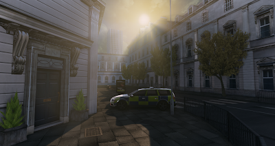
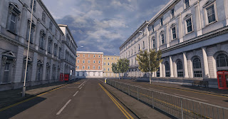
I have taken some shots of the scene at it's final hand in state. I plan to carry on improving some areas before the degree show, as there is always room for improvement. But for now I am very happy with how it turned out and I got some really good feedback from my lecturers.
Saturday, 28 April 2012
Lighting
Benn playing around with the sun position today. This is the first stage to my final lighting setup. As me and Tom have decide on a sun rise, i've been positioning the sun in places were a creeps out or sits between building to find the most interesting result.
My favouite has to be the last one. It cast the best shadows across the level and produces the best contrast between light and shadowed areas. This position also projects a beautiful light into the front of the bank. The best part is the effect when the light blinds your eyes as you walk out of the main entrance from the bank.
Its not final yet! I need to tweak the colour and values and intesity of the shadows, the sun itself and the sun size.
Fountain
I found it really hard to find reference for the fountain. I knew i didn't want a modern style fountain so I knew at least I could narrow my search down. I managed to dig up some images of the style I wanted and this gave me a good starting point of inspiration
To keep the poly count down for this asset, I knew i needed to create a high poly model to capture all the details I wanted to include. This was a trial and error process to make sure the low poly model captured all the details from the high poly model whilst still keeping the poly count to a minimum. I ended up remodelling and re uving this model around 3 time before I was happy with the final normal map I baked out.
The particle effects were a real challenge. My first attempt used only meshes with a modified version of my water texture that made it slow down the model into the water below. This looked to lifeless and clean.
The next attempt used particles. After many attempts and creating many textures, I felt I was getting to a realistic and believably result but there was something still missing.
I then tried using both meshed and particles. This gave the perfect balance of a strong flute pouring out, with the mess of foam that escaped the flow of the full force of the water.
From my finding I picked the elements that i found the most interesting and allow me to include the particle effects I had in mind for the end result.
I then planned out the final shape and silhouette. This helped me get a solid idea of the final result. I decided on the last iteration as this included all the elements I wanted.
To keep the poly count down for this asset, I knew i needed to create a high poly model to capture all the details I wanted to include. This was a trial and error process to make sure the low poly model captured all the details from the high poly model whilst still keeping the poly count to a minimum. I ended up remodelling and re uving this model around 3 time before I was happy with the final normal map I baked out.
The particle effects were a real challenge. My first attempt used only meshes with a modified version of my water texture that made it slow down the model into the water below. This looked to lifeless and clean.
The next attempt used particles. After many attempts and creating many textures, I felt I was getting to a realistic and believably result but there was something still missing.
I then tried using both meshed and particles. This gave the perfect balance of a strong flute pouring out, with the mess of foam that escaped the flow of the full force of the water.
Thursday, 26 April 2012
Ad 1 of 3
I've been having some fun with creating the ads for my level. I've decided on perfume. a phone and a car.
First of I started with the perfume. I had a look at what was already on the market. Then designed the shape of the bottle.
So here is the first of the list done. Had a hard time finding a French phrase or word but I ended up with "Je Veux" ( I want). I'm happy with that. I think it turned out really well
Quick skyline paint over
As mentioned in my last post I have done some quick paint overs to visualy convey the end result ofter adding in some skyline details. I really think this will help to break up the flat rooftops I have at the moment.
Monday, 23 April 2012
Distant Buildings
Finished of the rest of the low detailed buildings. One thing I have noticed is the skyline looks bare, so I will create some simple planes of some high rises and maybe add some chimneys and sky lights to the tops of the buildings. Other than that I am very pleased with the amount of details I have so far.
Friday, 20 April 2012
Building 3 and 4
Carrying on with the detailed buildings that now complete all the structural elements that are in close proximity to the main playable area around the bank. Again I drew my inspiration from real world examples and broke down the elements to include that were specific to those buildings.
It would take to much time and have a dramatic effect on performance if I was to create individual sets of assets for each building so I was very careful to pick elements that I could use to create different varieties of buildings.
In doing this it would also make sure that the theme for all the building would be consistent throughout. I will only be making subtle hue changes to the colour of the walls etc to add a slight variation.
Subscribe to:
Comments (Atom)


